&.
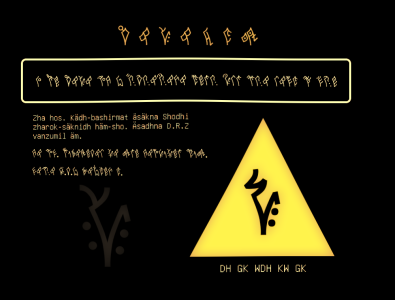
nothing beautiful can last
raiaQsuQ
Font by Eschar
(Download Here)
Raiaqsuq is the new writing system for Laiqbun, designed so that it’s possible to make a font for it.
But like, why?
Raiaqbun, the original Laiqbun writing system, is very hard to make a font for, due to the fact that it would need 25900 (a lot) different ligatures. That is terrifying, even as someone who’s never made a font. This is why I have asked someone whose whole thing is making fonts for constructed scripts that are good and humanly makeable. And wow, he’s good at what he does.
And what does it look like?
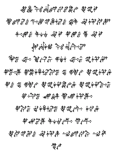
Here are some example sentences:
qe zheo chaioq kko ryq shao roaim kka xauim hy roeoq siuen kka haahui dy > kyo gyn qe zheo chaioq kko ryq shao shobui deu kka na dy
qe zheO chaioQ kko rq shaO roaiM kka xauiM H roeoQ siueN kka haAhuI D , KO gn qe zheO chaioQ kko rq shaO shobuI deU kka na D
zheailun na dy › rem kkeuacuan saeoq › len sha zauelun gyn qaei gyn tea saiaq ta dy
zheailuN na D , reM kkeuacuan saeoQ , leN sha zaueluN GN qaei GN teA saiaQ ta D
How to use
Due to the way the writing system works, Laiqbun is typed differently while using this font. It’s not a problem, though, as the result is still intelligible with original Laiqbun romanization. Here’s the two rules to type in Raiaqsuq:
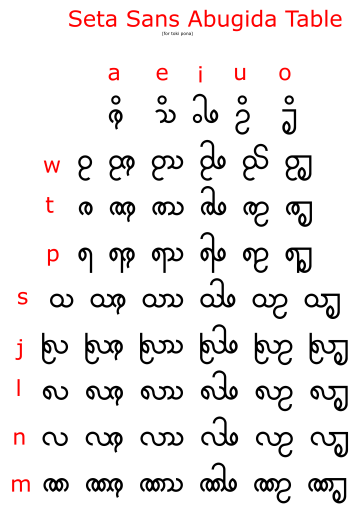
- Letters are grouped in pairs, if a letter is left unpaired, type it as an uppercase letter.
- Lone consonants have y as a vowel unless they are at the end of a syllable. The vowel y only pairs with other vowels and with final consonants.
- A period stops letters from forming blocks, it’s a zero-width space. I asked Eschar to add it solely to make sure people could come up with uwu faces.
- Make the font size about twice of what you use for any normal latin script, otherwise it’d look small and hard to read.
Punctuation
| Laiqbun punctuation | Raiqsuq punctuation | Raiaqsuq |
|---|---|---|
| > | , | , |
| ! | ! | ! |
| ? | ? | ? |
| «raiaq» | <raiaQ> | <raiaQ> |
| (zhao) {zhao} [zhao] | (zhaO) {zhaO} [zhaO] | (zhaO) {zhaO} [zhaO] |
Punctuation also has one new rule! the space before the pause punctuation now matters, ommitting the space now means there was a sudden interruption – think of it like this, compared to- HOLY SHIT WHAT WAS THAT.
Credit
Eschar is the person behind this writing system and its font. If you want a conlang font for yourself, you can contact him at escharotica@gmail.com, he doesn’t have a website himself so I’m putting his work here myself so y’all see it. Look at this stuff, it’s fucking awesome.


Special thanks to a Mysterious Benefactor, without whom it would have been impossible to make this font a thing.